OVERVIEW
Brand identity and visual system for an independent construction company focused on general contracting and handyman services.
The goal was to create a brand that felt dependable, hard-working, and straightforward — reflecting the hands-on nature of the trade while remaining clean and professional.
CONCEPT & DIRECTION
The identity centers around the idea of skilled labor and pride in craftsmanship. Construction branding often leans either overly corporate or overly rustic; this project aimed to strike a balance between approachability and authority.
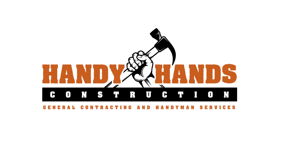
A bold typographic structure paired with strong horizontal bars creates a sense of stability and structure, visually echoing the foundations and framing work central to construction.
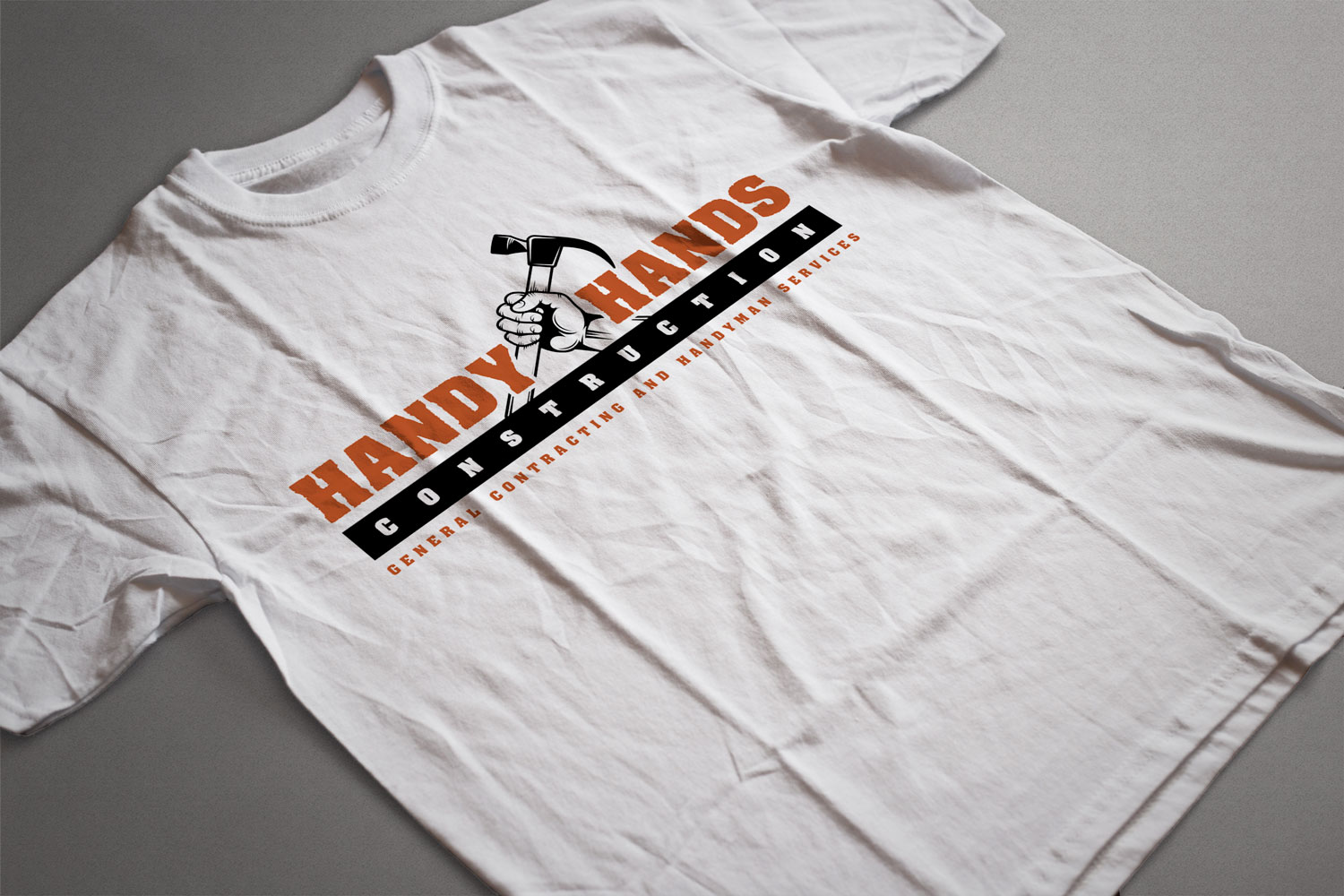
The custom hand-and-hammer mark reinforces the brand name while symbolizing hands-on expertise and problem-solving. Its simplified, high-contrast treatment ensures strong visibility across workwear, vehicles, signage, and print materials.
The orange and black palette was chosen for its association with safety gear and industrial environments, helping the brand feel authentic to the trade while remaining highly legible in real-world applications.
EXECUTION
The identity was designed to function across practical applications including apparel, equipment branding, signage, and promotional materials.
Special attention was given to scalability and clarity so the mark remains strong whether embroidered on uniforms or printed on large-format surfaces like trucks and job site banners.