OVERVIEW
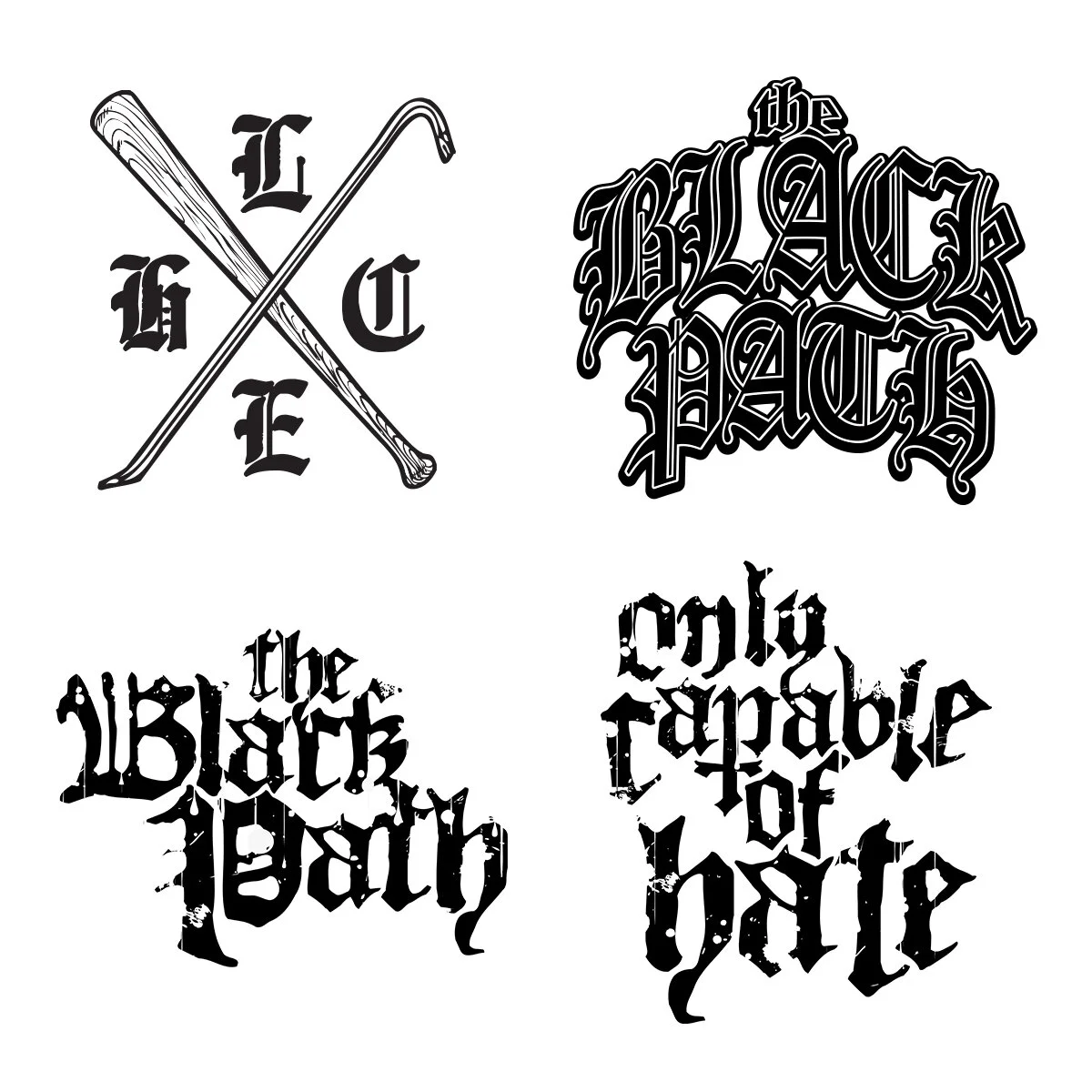
Merchandise design and visual identity work for California hardcore band The Black Path.
This project focused on creating a cohesive set of marks and graphics that could live across apparel, promotional materials, and releases while maintaining a consistent and recognizable visual presence.
CONCEPT
The direction centered on strong, straightforward branding that reflects the band’s sound without relying on trends or overly decorative elements.
The core monogram mark was designed to feel structured and balanced, drawing from traditional athletic and heritage-style insignias. Supporting graphics explore heavier typographic treatments and simplified iconography to create variation while staying within the same visual system.
A restrained black-and-white palette was used to keep the designs bold, adaptable, and cost-effective for merchandise production.
EXECUTION
All graphics were designed with apparel in mind, ensuring they reproduce cleanly at different sizes and placements such as full back prints, chest hits, and smaller accessory applications.
The identity system allows the band to release varied merchandise while maintaining visual consistency across different drops and tour cycles.