OVERVIEW
Brand identity and apparel system for a heavy-duty trucking company offering truck repair and pilot car services.
CONCEPT
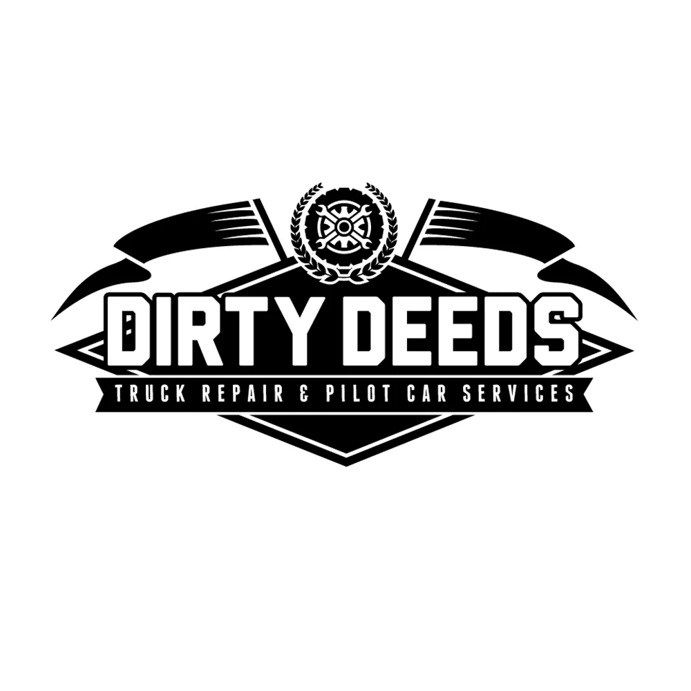
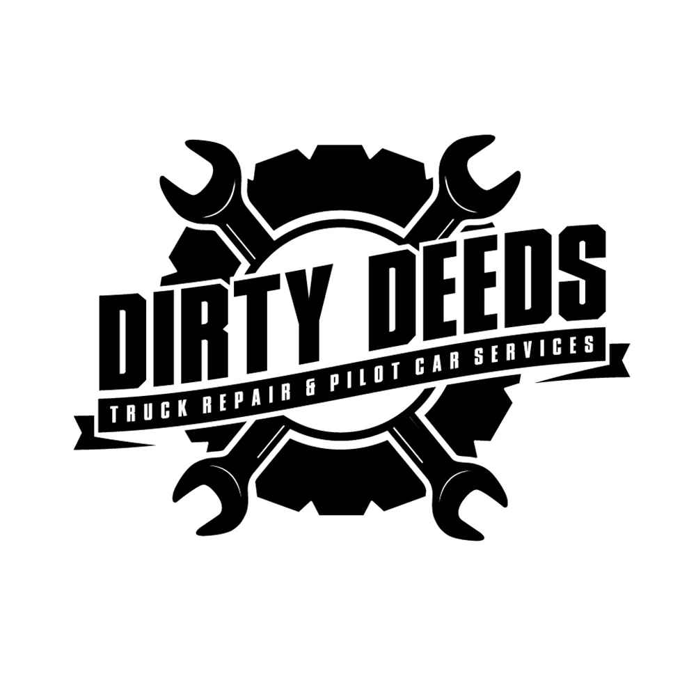
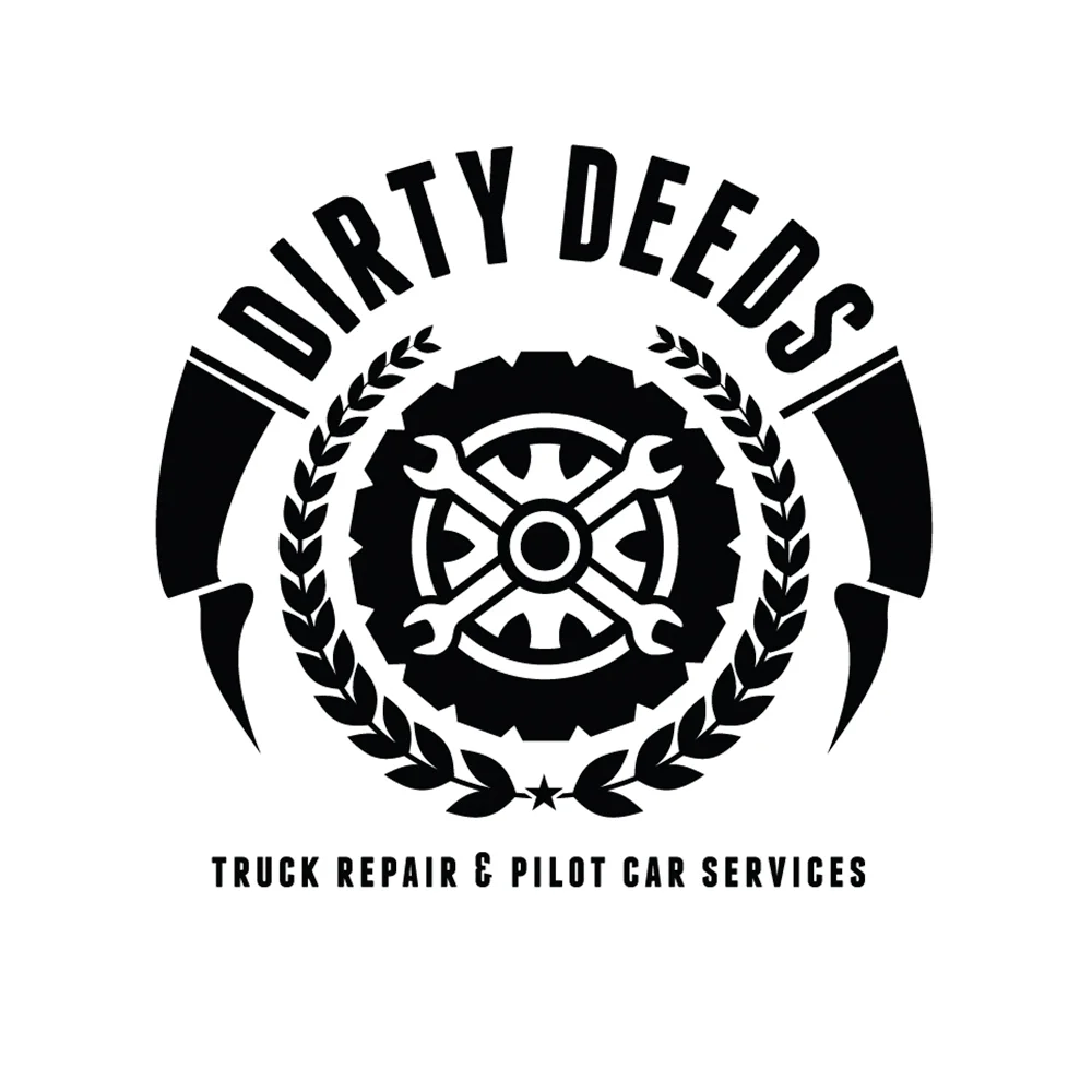
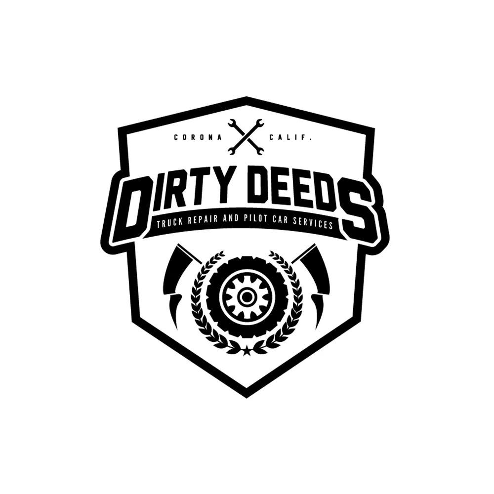
The brand needed to feel tough, dependable, and built for long-haul work. The identity draws from industrial and motorsports influences to communicate strength, reliability, and mechanical expertise. Emblems, crests, and badge-style marks reinforce the idea of durability and pride in hands-on trade work.
Bold geometry and symmetrical layouts give the brand a commanding presence, while mechanical symbols reference precision, repair, and heavy equipment. The visual tone positions the company as experienced, capable, and ready for demanding jobs.
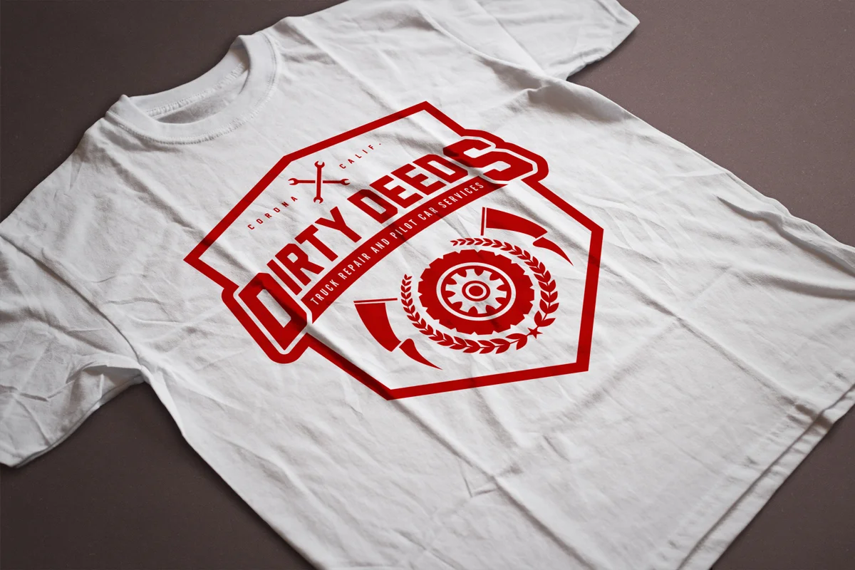
EXECUTION
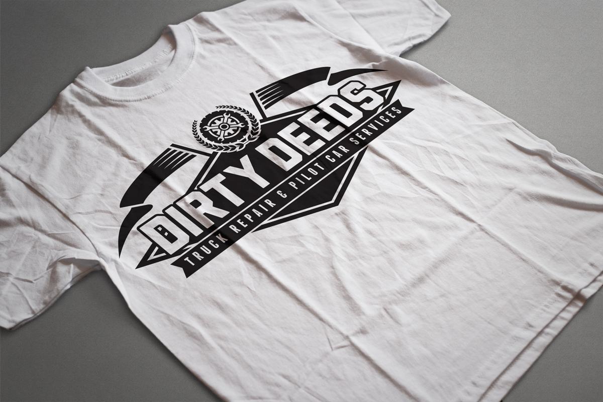
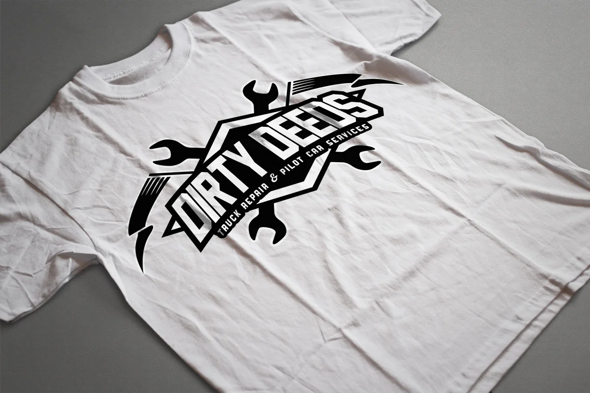
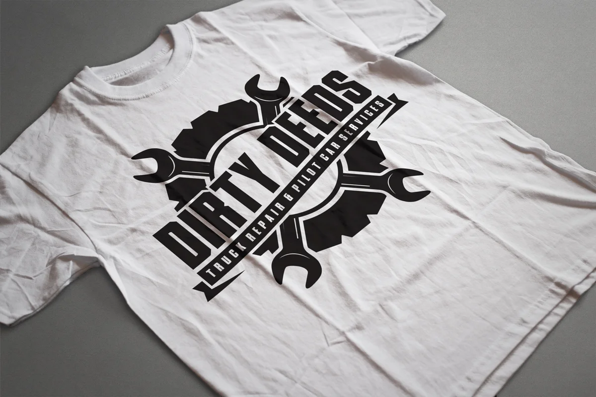
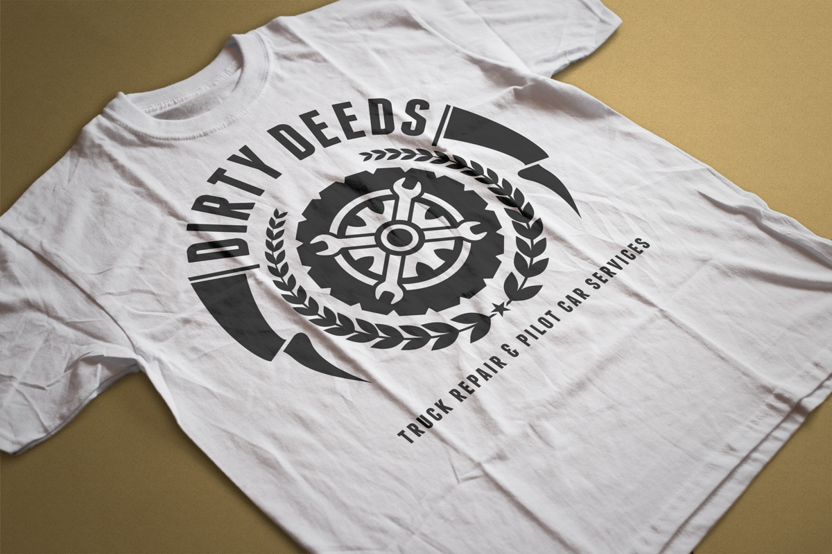
A primary shield-style logo anchors the identity, combining strong typography with layered emblem elements to create a mark that feels established and authoritative. Supporting badge variations allow flexibility across uniforms, vehicle graphics, decals, and merchandise.
The black-and-white palette ensures high contrast and practical production across embroidery, screen printing, and vinyl applications. Apparel mockups demonstrate how the identity holds up in real-world use, reinforcing brand visibility in work environments and on the road.
The final system provides a cohesive visual language that works across branding, workwear, promotional materials, and fleet applications while maintaining a bold, industrial character.