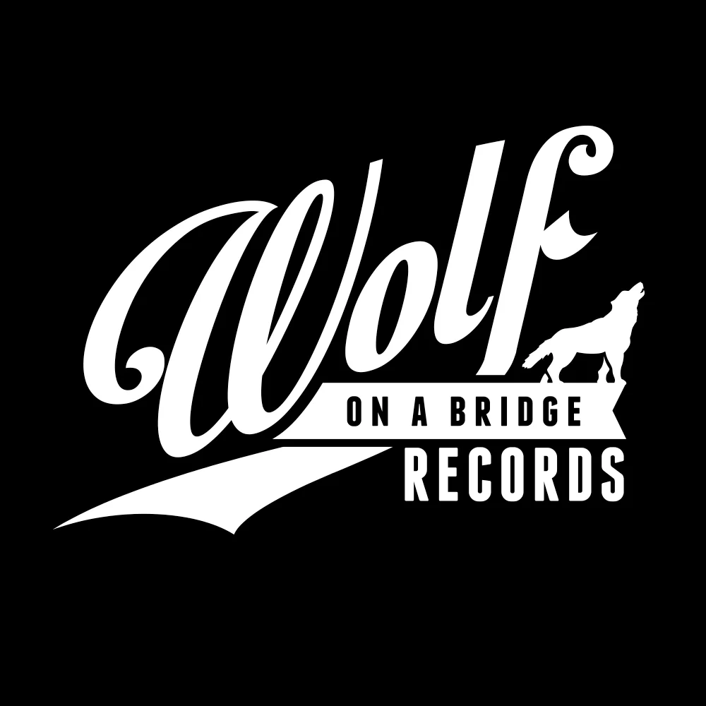
OVERVIEW
Brand identity for an independent punk rock record label focused on releasing limited-run 7-inch vinyl.
CONCEPT
The identity needed to feel rooted in punk culture without leaning into clichés. The goal was to balance grit with clarity, creating a mark that felt timeless, confident, and recognizable at small sizes across record sleeves, labels, and merchandise.
The wolf symbol represents independence and loyalty to underground music culture, while the bridge element subtly references connection, community, and the label’s role in bringing artists and listeners together.
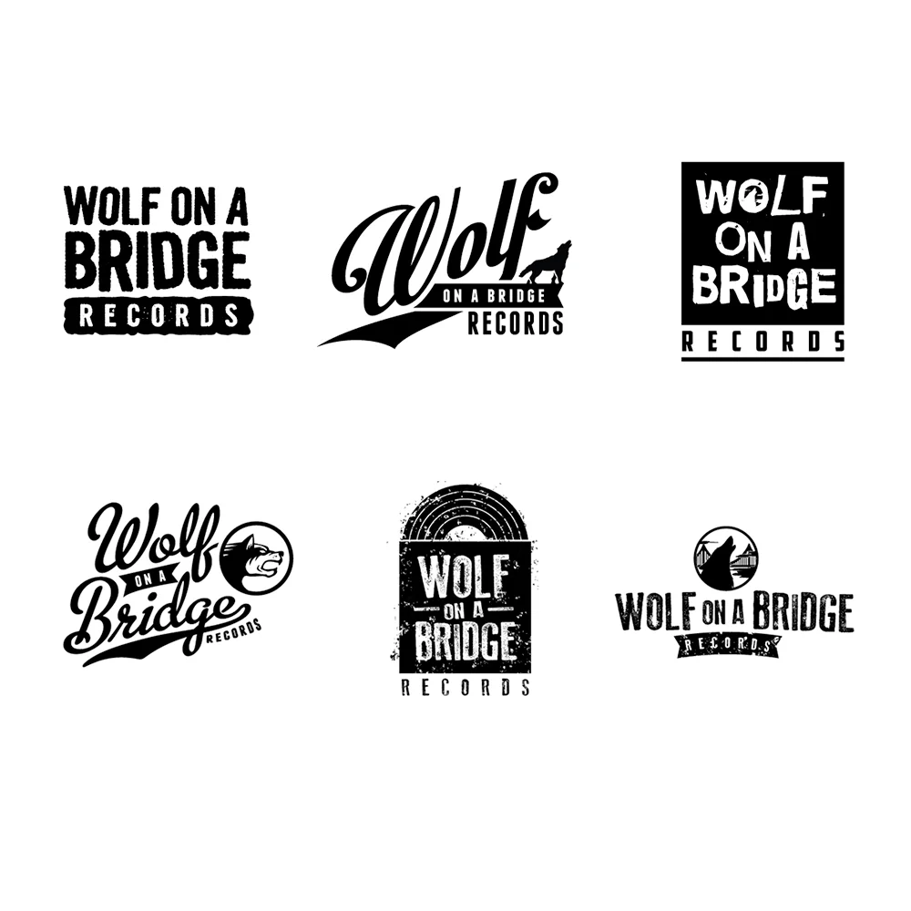
EXECUTION
A bold script wordmark anchors the identity, giving the brand a strong presence while maintaining a classic, record-label feel. Supporting icon variations pair the wolf silhouette with simplified bridge imagery to create flexible secondary marks for stamps, inserts, and vinyl center labels.
The black-and-white palette keeps production practical and cost-effective for small-batch printing while reinforcing the raw, no-frills attitude associated with punk releases.
The system was designed to scale easily across album packaging, merch, promotional graphics, and social assets while remaining instantly recognizable.