OVERVIEW
Full brand identity design for Green Eagle Productions, an instrumental and hip hop artist collective focused on producing original beats and collaborative music projects.
CONCEPT & DIRECTION
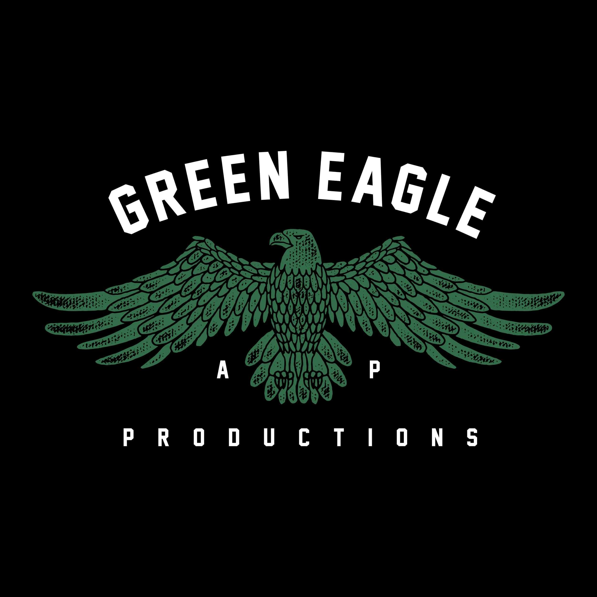
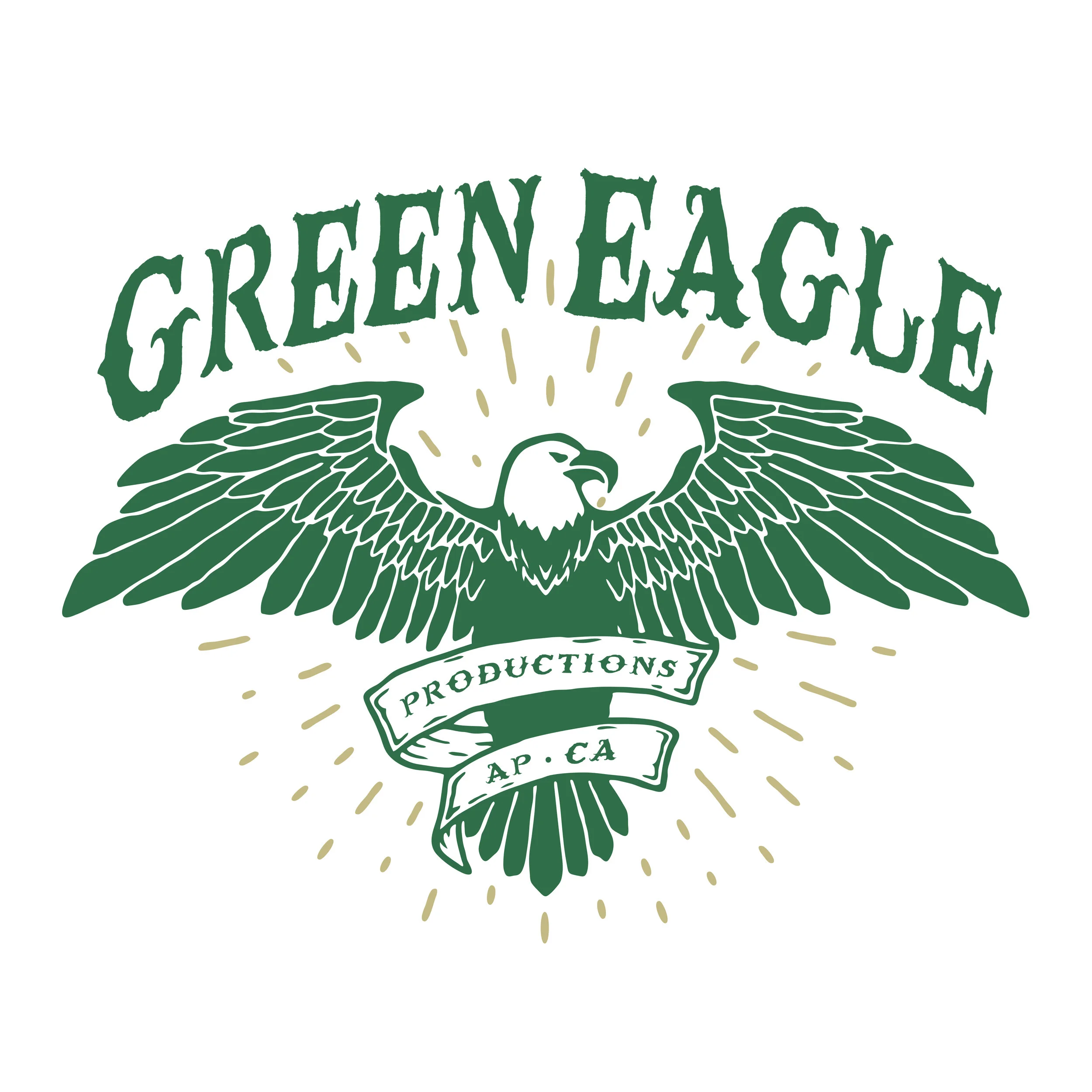
The identity was built to reflect strength, unity, and creative independence within the collective. Drawing inspiration from classic record label marks and heritage insignias, the eagle emblem symbolizes elevation, vision, and artistic freedom while reinforcing a sense of brotherhood among members.
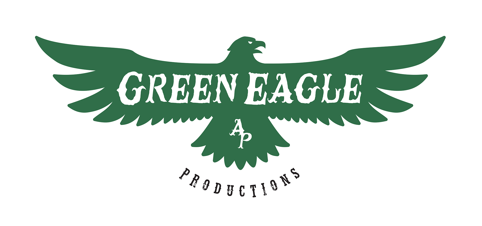
The bold, collegiate-style typography and structured badge composition give the brand a timeless, authoritative presence that feels equally at home on digital platforms, merchandise, and physical media.
A restrained color palette anchored by deep green tones reinforces the name while giving the identity a distinctive, memorable visual signature.
EXECUTION
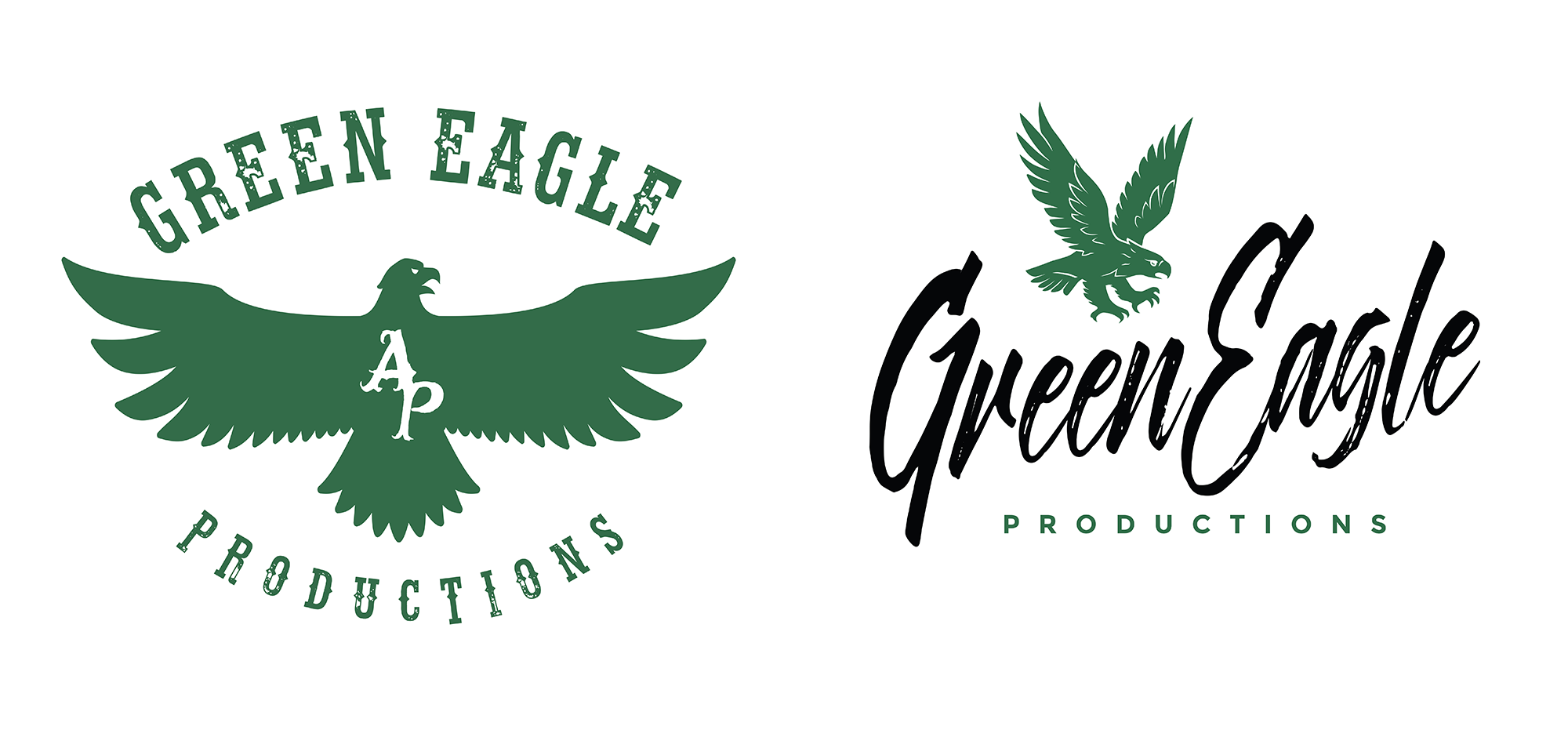
The system was designed for flexibility across album artwork, apparel, promotional materials, and digital releases. Multiple lockups and variations ensure the mark remains recognizable whether displayed as a primary logo, stamp, badge, or simplified icon.
Careful attention was given to line weight, symmetry, and detailing within the eagle illustration to create a mark that feels powerful at large scale while remaining legible and iconic in small applications.
ROLE
Brand identity design, art direction, and visual system development.